Moodboard

GREEN SYMPHONY


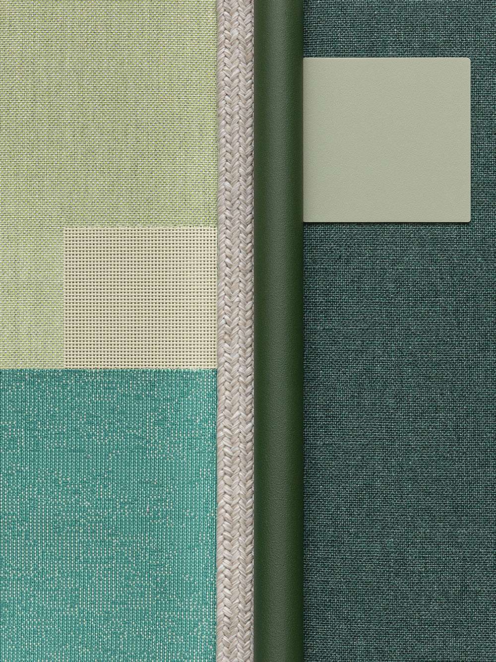
This moodboard is reminiscent of the surfaces and colours of a lush forest. It plays on light and dark green tones of the Menta, Amazzonia and Selva fabrics. These interact with two exotic aluminium shades: Green Tea and Dark Green. Like a lunar ray penetrating from above in the thick foliage, the Moon-toned rope creates a distinctive accent.

Green has long represented life, growth and youth: in the past, this colour was deemed synonymous with magical healing powers and good health. Green - in all its shades - is a perfect colour for outdoor furnishing because it can create suggestive tone-on-tone combinations, blending into the surrounding environment. Its relaxing and calming qualities merge with the tranquillity of the natural spaces, producing an enveloping, immersive result. The use of super-light accents helps define and highlight, creating a refined graphic impact.

BETWEEN SKY AND SEA


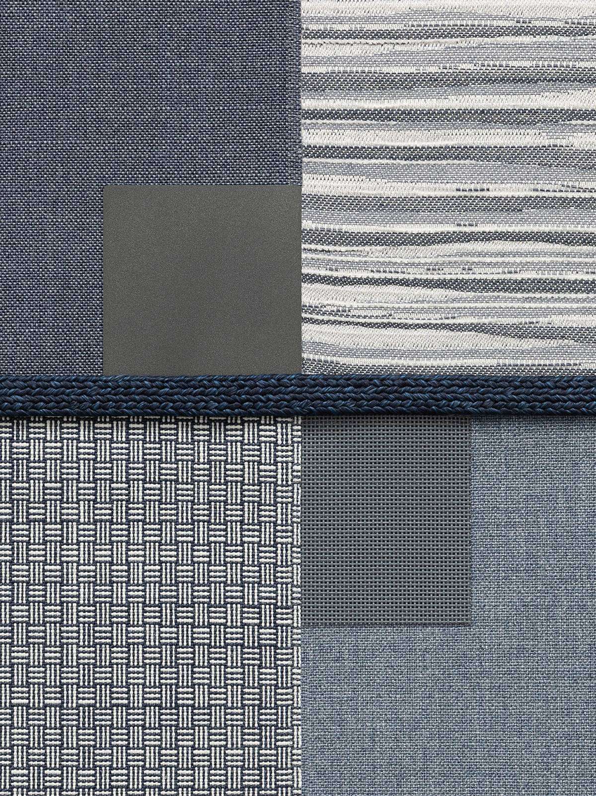
This moodboard looks to the classics in its textures, exploring all the chromatic possibilities of the multiform colour blue: from dark blue skies (the Dark Blue finish) to the busy surface of Blue, which resembles a body of water with foamy white waves; from the Ocean rope to the refined and solid Slate Blue; from River to the timeless Denim, which was once - not by chance - the chosen fabric of sailors (it was called the 'Genoa fabric').

Blue is a somewhat mysterious colour: just by looking at it, we feel lighter and dreamier. It is solid, reliable and soothing, and in an outdoor environment, it inevitably recalls water and its enveloping feature. It is perfect by the seashore or the lake; it conjures up images of vacations and nostalgia, and is as welcoming as an embrace. It is a refined and versatile choice, whatever the context.

MOTHER EARTH


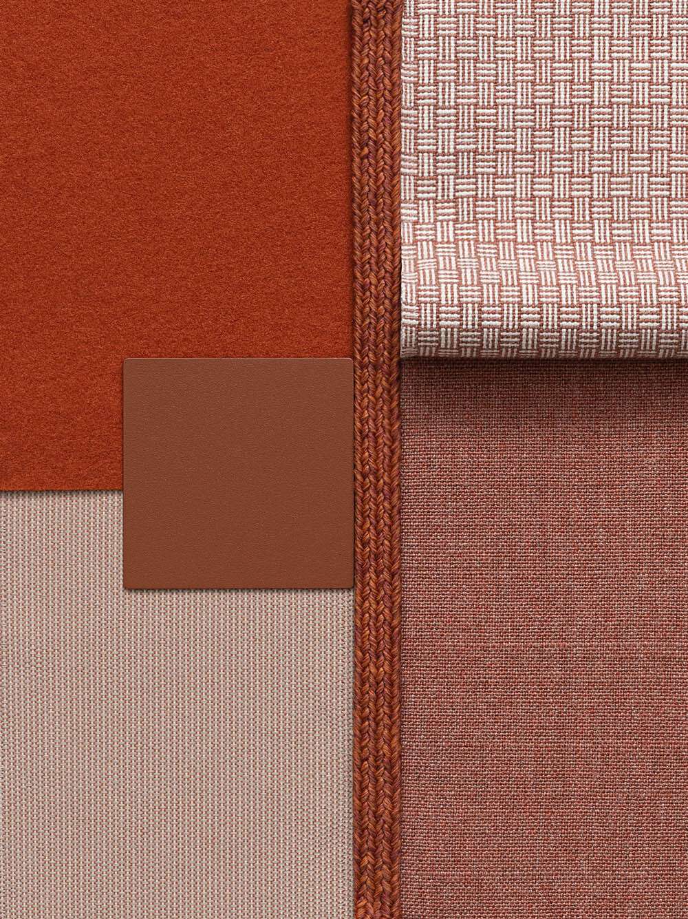
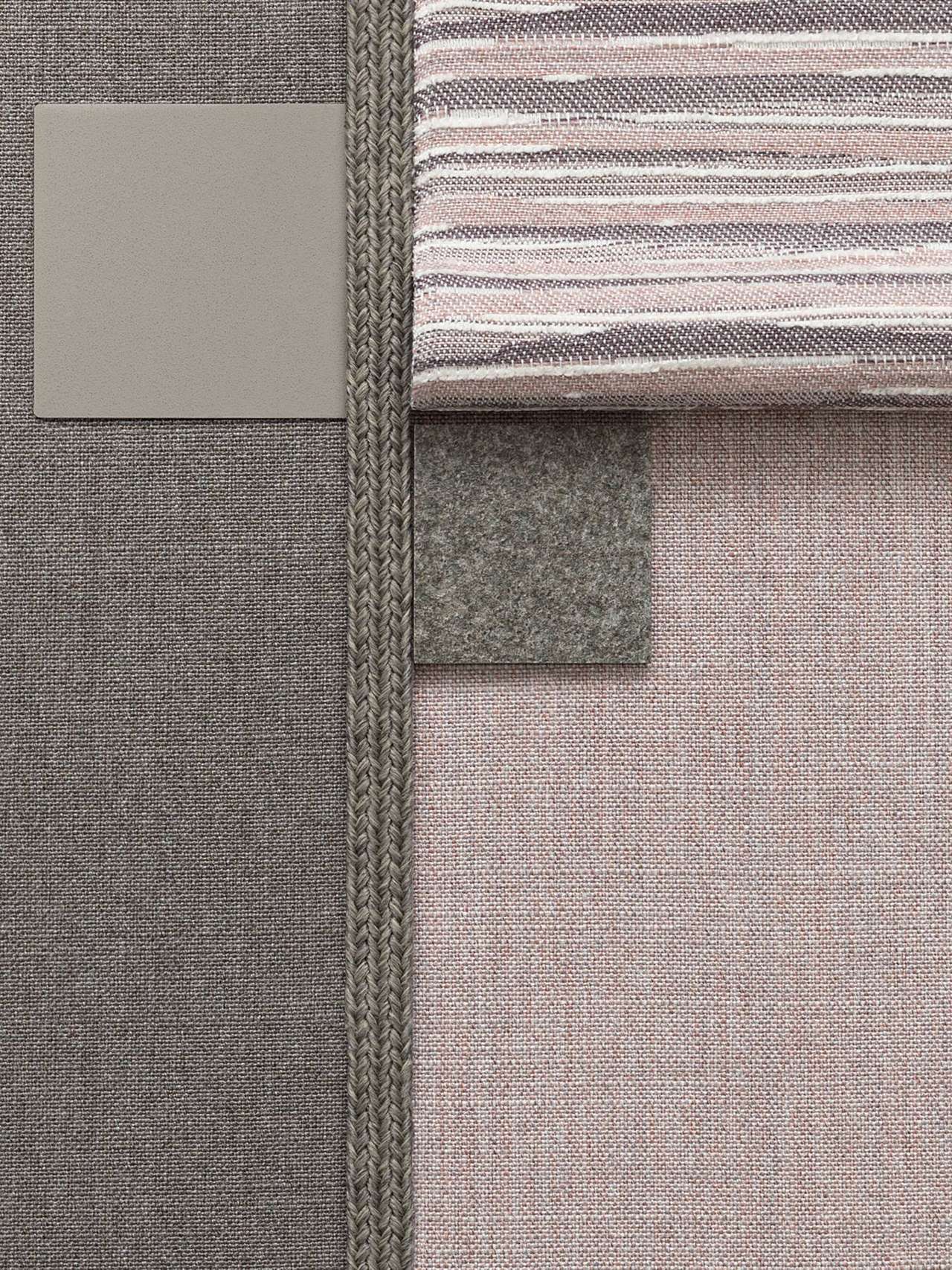
Warm and textured hues for this moodboard, which is reminiscent of the earth. The aluminium "warms up" thanks to the Terracotta finishing, while the Copper felt adds an antique tactile effect. The Blush and Kelso Pink fabrics introduce a light-dark graphic juxtaposition, bringing into contact earthy tones and very light auroral features; the Starfish fabric embodies the more exotic soul of this combination, further defined by the Arizona rope, whose name immediately guides our thoughts towards the sunburnt deserts.

But all variations of brown are reminiscent of Mother Earth: it's a solid, atavistic, tactile and even sensual colour. It is the colour of fullness, of plentifulness; it evokes the earth - a material we mould - and it is the colour of doing: of building, constructing, giving protection and persistence. In an outdoor environment, brown is the colour which best interacts with the surrounding green for a harmonious and complementary result. It has a rustic feel and can warm up any environment.

LET IT SNOW


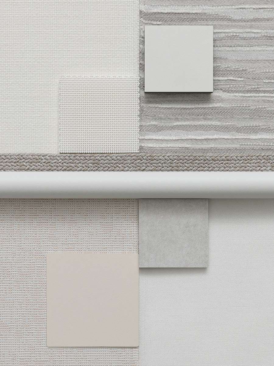
This moodboard has a Nordic feel to it and it places white at the centre: this colour has the incredible ability to always take on new shades; it is much livelier than that image of absoluteness and immobility which are often associated with it. The very same hue conveys a different vibe depending on the material it is combined with, whether that's fabric (White, Cotton and Pergamena), batyline (White), aluminium (White and Creamy White), Hpl (White) and stoneware (Snow). Two greys - the Moon rope and the Cima Grey fabric - come together to bring solidity.

Just like black, white is a chromatic extreme. It often reminds us of light and emptiness, two presences/absences which we often find in Nordic environments: the endless expanses of white, silence and purity. In furnishing, it is the ultimate minimalist colour and the one which best represents its rigour. If in ‘complete white’, any outdoor environment will take on an iconic and refined character, thanks to this colour's ability to harmonise with any hue without ever disappearing. It is very much a conscious declaration of style.

MARINE MODIFICATIONS


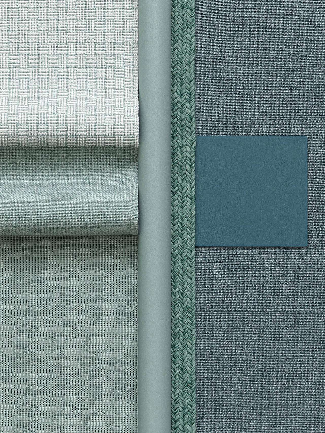
This moodboard explores the hues and points of contact between green and blue inspired by the different shades of the sea. The block colour of the Lagoon fabric enters a tone-on-tone dialectic with the Blue Teal aluminium finish. Light blue – again an aluminium finish - forms a duet with the textures of the Green, Willow and White Musk fabrics, while the green soul of the composition is expressed in the Mint rope.

The shades ranging from green to blue symbolise progress, the transition between the regeneration of nature awakening and the meditative depth of the abyss. The foliage of the trees reflected in the expanse of water creating a game of sinking and refraction where the aquatic blue hue also alludes to the infinite colour of the cosmos.

This is a set which reassures and concurrently energises; a versatile combination which is charismatic but far from intrusive. Ideal for outdoor settings, it is an invitation to experiment in indoor settings too, especially work settings, owing to the professional and relaxing effect it generates.

SOUTHERN WIND


South-facing combinations: Apricot, Canyon, Coral and Colorado for the fabrics, Maracuja for the aluminium finish - the dark accent lends the whole solidity and character - Corten for the stone, also in darker hues, but with a softer and more pasty rendering. The rope is a poetic Sunset.

A moodboard that conveys energy by bringing to mind flaming red skies and sun-kissed stones. The ancient desert populations used red powders because of their healing and propitiatory qualities; red was also the colour of the love spells, or of rituals to evoke rain by dancing with faces painted in red ochre.

A highly expressive whole, which infuses warmth and an exotic twist to its surroundings. Ideal as a note of contrast amid the vegetation but also by a pool, easily paired with a blue and white colour scheme. Colours which love summer and help to remember it in winter.


MORNING DEW


When the frost wraps the foliage, depositing itself in the form of tiny drops of dew: this is the atmosphere brought to mind by this delicate combination of greys and soft greens. The two Mist and Savana fabrics, emphasised by the Rock rope, take shape in the Hazel stone and in the Pearly gold aluminium. In contrast, the Sage and Liquen fabrics together with the Ecru Batyline and the silky solidity of Green Tea aluminium.

A simple yet sophisticated set which incorporates echoes of the Orient: Chinese landscape painting and Zen gardens, with well-honed stones and artfully raked gravel. This choice is suitable for both domestic and contract settings because of its discreet and evocative qualities, as well as its reassuring effect on the eye.

All-season colours which invite the observer to imagine both an early morning hike in the forest and a sunrise amid the cloud-covered peaks in a mountain living room.


THROUGH THE FOG


The sea in autumn, with its metal-coloured waves under a misty white sky. Or some blazing afternoons in the hills, with the tree line that stands out against the impassable velvet of the fog. But also cold winter sunrises, where the sky is tinged with pink peeping through the thick clouds.

These are the suggestions brought to mind by a classic moodboard which plays with shades of grey in gentle contrast with the pastel range of violet: fabrics such as Corteccia, Lavander and the variegated Violet acquire a strong countenance thanks to Pearly Gold aluminium. The Rock rope and the Smoky grey stone offer two different textured renderings in the same colour.

Grey is a calm, solid and professional colour. The pink/violet hues soften it, making this set extremely elegant without being lavish, and sober without being cold. Immersed in greenery, it has a stable and harmonious effect.

LIGHT AND DARK


Without half measures, this dialectic set plays on the contrasts of absolute black & white and their variants. The fabrics range from Grey, to Black, Graphite, and Dark grey. The two aluminium finishes aim for the essential: Black, Metallic grey and White. Night stone introduces an almost mysterious atmosphere, reaffirmed by the Black Sand rope.

A bold chromatic choice which cannot go unnoticed. The strong black effect is built on nightfall and the fading of all colours. Yet it is immediately counteracted by white, its opposite, the other chromatic limit. White is light and dim, but also silence, a vast expanse of space and quiet.

A moodboard which, applied to furniture, is extremely simple to match with any other outdoor setting, whether natural or urban. It has the virtue of not disappearing into the surroundings and at the same time not causing visual discordance, but rather a solid and evident harmony, always.


THE SKYES OF ICELAND


This ultra-sophisticated combination of materials and colours recalls the Northern skies: fabrics such as Grey, Ash and the paradigmatic Iceland find consonance and solidity in the Iron Grey, Grey and Powder Grey aluminium finishes. The Moon rope completes the set with its enveloping and gentle presence.

Arranged here in its lighter and pastel-like shades, grey loses its undecided and heterogeneous nature to endow itself with a discreet yet present character. Grey embraces contrasts and smooths them out. In furniture, it is par excellence the colour which makes all other hues stand out: the green foliage and the red and yellow flowers appear saturated and brighter than ever before on days when the sky is veiled with grey.

This is the ideal moodboard for any context, and it can be livened up by including furnishing elements or contrasting details, in the name of ultimately free customisation.